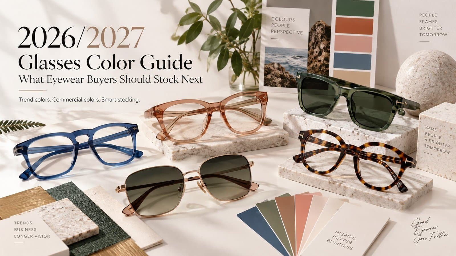
2026/2027 glasses color trends are moving in two directions at once: softer, quieter neutrals are becoming more important, while selected blues, greens, oranges and pinks are creating stronger seasonal statements.
For eyewear buyers, however, knowing the trend color is only the beginning.
A shade that looks exciting in a trend report may become difficult to sell when applied to a full acetate frame. A neutral that seems ordinary on screen may become highly commercial when translated into translucent acetate, brushed metal or a smoke lens combination.
The useful question is therefore not simply:
“What colors are trending?”
It is:
“Which trend colors can be converted into eyewear that customers will actually buy?”
This guide looks at the 2026 and 2027 color direction from a wholesale eyewear perspective — including frame materials, lens combinations, sales channels, SKU planning and bulk-production color approval.
What Are the Eyewear Color Trends for 2026 and 2027?
Eyewear color does not develop in isolation.
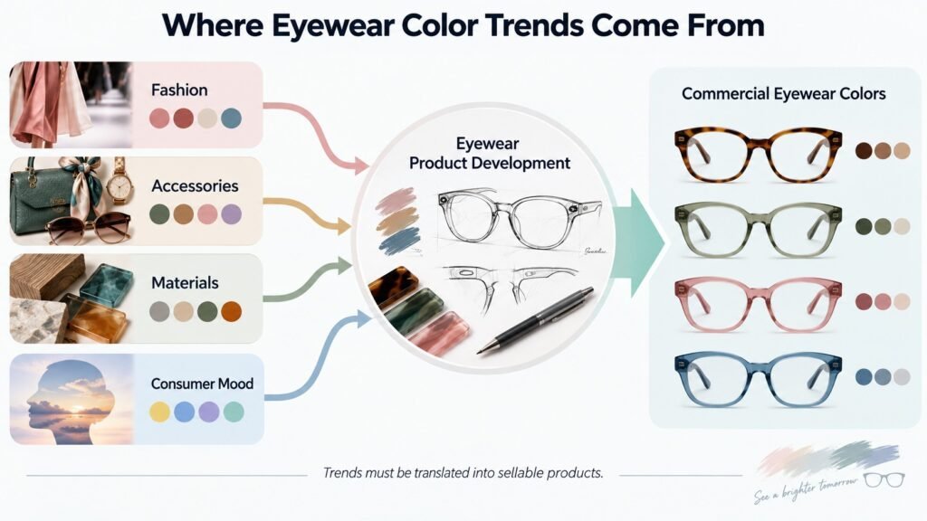
Color direction usually moves through fashion, accessories, beauty, interiors, consumer products and material design before brands translate it into commercially viable eyewear.
WGSN explains that its color forecasting considers broader changes across society, technology, environment, politics, industry and creativity. Its forecasts are developed ahead of the selling season and across multiple product categories.
That distinction matters.
A fashion forecast tells you where consumer aesthetics may be moving. It does not tell you that every optical frame or sunglass should be produced in exactly the forecasted shade.
For eyewear, every trend must pass through four filters:
| Trend Question | Eyewear Buyer Question |
|---|---|
| Is the color gaining attention? | Will customers wear it on their face? |
| Does it photograph well? | Does it still look good under normal retail lighting? |
| Does it work in fashion? | Can acetate, TR90, PC or metal reproduce it effectively? |
| Is it new? | Can the SKU sell beyond one short trend cycle? |
This is why commercial eyewear palettes usually develop more slowly than social-media color trends.
The objective is not to copy every forecast.
The objective is to identify which color direction can become a profitable product.
2026 Color Trends: From Cloud Dancer to Softer Neutrals
One of the clearest signals for 2026 is a movement toward lighter, quieter and more adaptable colors.
Pantone named PANTONE 11-4201 Cloud Dancer its Color of the Year 2026, describing it as an airy white that supports simplification, clarity and calm. Pantone also specifically pairs the shade with powdered pastels, softened colors and neutrals.
For eyewear buyers, the useful takeaway is broader than “produce white glasses.”
Cloud Dancer suggests an opportunity for a family of softer commercial colors:
- milky white
- translucent ivory
- warm cream
- light beige
- pale grey
- dusty blush
- soft blue-grey
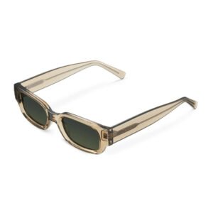
- transparent champagne
These colors can work particularly well when the goal is to create an understated collection rather than a high-impact fashion SKU.
Cloud Dancer Does Not Mean Every Frame Should Be Pure White
Pure opaque white can be visually strong on eyewear and may be more difficult for some retailers to sell as a core color.
A more practical translation could be:
Cloud Dancer inspiration → translucent ivory acetate
or:
Cloud Dancer inspiration → warm off-white temple + smoke lens
or:
Cloud Dancer inspiration → pale neutral optical frame with polished transparency
This keeps the trend direction while making the product easier to merchandise.
There is another important point: Pantone is not the only forecasting system.
WGSN × Coloro selected Transformative Teal as its 2026 Color of the Year and identified other S/S 2026 colors including Electric Fuchsia, Blue Aura, Amber Haze and Jelly Mint.
These are not contradictory forecasts. They reflect different forecasting methodologies.
For eyewear buyers, they show that 2026 should not be interpreted as an all-neutral year.
A stronger assortment can combine quiet commercial neutrals with a smaller number of expressive colors.

2027 Color Forecast: Which Colors Should Eyewear Buyers Watch?
For S/S 2027, WGSN × Coloro announced five Key Colours:
Luminous Blue, Energy Orange, Pop Pink, Meadowland Green and Clay.
Luminous Blue was also selected as their Color of the Year 2027.
Here is how we would translate these forecasts into eyewear development rather than copying them literally.
| WGSN × Coloro S/S 2027 Color | Coloro Code | Possible Eyewear Application | Commercial Risk |
|---|---|---|---|
| Luminous Blue | 125-28-38 | Translucent acetate, glossy optical frames, blue-metal accents | Medium |
| Energy Orange | 018-57-34 | Sports eyewear, temple accents, transparent orange | Higher |
| Pop Pink | 151-73-22 | Fashion sunglasses, youth collections, translucent frames | Medium-High |
| Meadowland Green | 050-61-19 | Acetate optical frames, olive interpretations, lifestyle sunglasses | Medium |
| Clay | 014-60-13 | Warm neutral acetate, optical frames, brown-gradient lens pairing | Lower |
WGSN describes Luminous Blue as suitable across categories and seasons, while Energy Orange is positioned strongly toward accessories, sports and outdoor products. Pop Pink carries a playful, youth-oriented direction; Meadowland Green connects with nature and versatility; and Clay is a warm, pink-toned neutral associated with resilience and longevity.
For wholesale eyewear, Clay may therefore deserve more attention than its visual impact suggests.
It is less dramatic than Energy Orange or Pop Pink, but that is exactly why it can be easier to convert into a wearable optical frame.
What About Late 2027?
The later A/W 2027/28 WGSN × Coloro palette expands the direction further with Luminous Blue, Russet, Peaceful Lilac, Maize and Deep Green.
That gives buyers another useful signal: earthy browns, deeper greens, softened lilacs and warmer yellows are worth watching alongside the brighter S/S palette.
Do not build your entire 2027 order around one forecast.
Watch which colors continue appearing across multiple seasons.
Those are usually more interesting for commercial eyewear.

Trend Colors and Commercial Colors Are Not the Same Thing
This is one of the biggest mistakes in eyewear assortment planning.
A color can be highly visible online without becoming a high-volume retail color.
For example, bright orange frames may perform extremely well in campaign photography. But a retailer selling everyday prescription frames may sell far more transparent brown, tortoiseshell and black.
Both colors still have value.
They simply have different jobs.
| Color Type | Main Job | Typical Examples | Suggested Buying Role |
|---|---|---|---|
| Core commercial | Generate stable volume | Black, tortoise, brown, clear, gunmetal | Main stock |
| Updated neutral | Refresh the core assortment | Clay, ivory, smoke grey, olive | Expansion stock |
| Seasonal fashion | Create freshness | Luminous Blue, soft lilac, Pop Pink | Controlled test |
| Statement color | Attract attention | Energy Orange, vivid yellow, electric pink | Small test / campaign SKU |
A practical starting point for a new collection could be:
60% core commercial colors + 30% updated seasonal colors + 10% experimental colors.
This is not an industry rule. It is a buying framework.
A fashion-led boutique may reverse the balance. A pharmacy chain selling reading glasses may need significantly more conservative colors.
The important point is that every color needs a role in the assortment.
The Same Color Looks Different on Acetate, Plastic and Metal
Sending a supplier a Pantone number does not guarantee that three different materials will look identical.
The substrate, transparency, production process and surface finish all affect how the final frame is perceived.
Acetate
Acetate gives buyers more opportunities to work with depth, transparency, layered effects and complex patterns.
A muted green can become:
- transparent olive
- solid forest green
- layered green tortoise
- smoky green crystal
- polished green marble
Even though these products belong to the same broad color family, they create completely different retail positions.
This is one reason acetate is useful for brands that want color itself to become part of the product story.
Injection-Molded Plastic
PC, TR90 and other injected frame materials are often better suited to repeatable solid colors and high-volume production.
A color may look flatter than an acetate interpretation, but that can be an advantage when the target is sports eyewear, affordable sunglasses or large wholesale programs.
Gloss level also matters.
A glossy beige frame and a matte beige frame can feel like two different products even when the base pigment is similar.
Metal
Metal introduces another variable: finish.
The buyer may not simply be choosing “silver,” “gold” or “blue.”
The final appearance can depend on whether the product uses a polished, brushed, painted or plated surface, depending on the frame material and finishing process.
For example:
Luminous Blue on acetate could appear deep and translucent.
Luminous Blue on injected plastic could appear clean and saturated.
Luminous Blue on metal could become a cooler metallic accent.
Same color direction. Different product.

Frame Color Is Only Half the Product: Choose the Right Lens Color
For sunglasses, the frame cannot be developed separately from the lens.
Consider these combinations:
| Frame Color | Lens Direction | Commercial Effect |
|---|---|---|
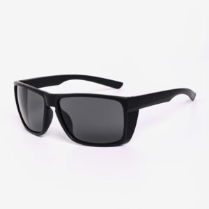
| Black | Grey / green / mirror | Safe, versatile, sports or classic |
| Tortoise | Brown / gradient brown | Warm, familiar, premium |
| Clear / ivory | Smoke grey / light brown | Clean, contemporary |
| Clay | Brown gradient / rose-brown | Tonal and premium |
| Olive / Meadowland Green | Smoke / green / brown | Outdoor and lifestyle |
| Luminous Blue | Grey / blue-grey / mirror | Technical or fashion-led |
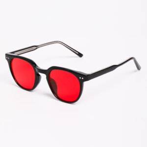
| Pop Pink | Smoke / rose / gradient grey | Youth and fashion |
| Energy Orange | Grey / mirror / contrast lens | Sport and statement |
This is especially important with transparent frames.
A translucent orange frame paired with an orange lens may become too monochromatic. The same frame with a neutral CAT3 grey lens can become much easier to wear.
Conversely, a simple black frame may become a new SKU almost entirely through the lens treatment.
For buyers, lens color is therefore not a final accessory decision.
It should be approved together with the frame.
How Should Wholesale Buyers Build a Color Assortment?
Do not begin by asking your supplier:
“What are your most popular colors?”
Start with your SKU roles.
For a six-color frame, a balanced test could look like this:
- Black — commercial anchor
- Tortoise or brown — warm commercial anchor
- Clear or ivory — modern neutral
- Clay or soft olive — trend-informed neutral
- Luminous Blue or Meadowland Green — seasonal color
- Pop Pink or Energy Orange — experimental color
The exact combination depends on your customer.
But this approach prevents the common problem of ordering six colors that all serve the same customer.
Do Not Buy Five Versions of the Same Neutral
A collection containing clear grey, smoke grey, transparent brown, light tortoise and champagne may look beautifully coordinated in a sample room.
At retail, however, these colors may compete for the same customer.
Color variation is not the same as assortment variation.
Each additional color should broaden the selling opportunity.
Choose Colors by Sales Channel, Not Only by Trend
A color that works for an online fashion brand may not be the right stock decision for a supermarket or optical chain.
| Sales Channel | Safer Core Colors | Colors Worth Testing |
|---|---|---|
| Optical stores | Black, tortoise, clear, brown, gunmetal | Clay, olive, translucent blue |
| Fashion boutiques | Tortoise, ivory, clear | Pop Pink, Luminous Blue, lilac |
| Online DTC brands | Black, tortoise, clear | Stronger seasonal colors and transparent effects |
| Sports / outdoor | Black, grey, navy | Energy Orange, green, blue, mirror accents |
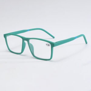
| Pharmacy / reading glasses | Black, brown, tortoise, navy | Soft red, olive, lavender |
| Resort / summer retail | Clear, tortoise, cream | Orange, aqua, pink, translucent green |
The point is simple:
A trend becomes commercially useful only after you connect it to the customer, channel and price point.
If your buyer sells to a conservative optical customer, the 2027 trend may be best translated as Clay rather than Pop Pink.
If the buyer sells sports sunglasses, Energy Orange becomes much more relevant.
How to Approve Custom Eyewear Colors Before Bulk Production
Never approve a custom eyewear color from a laptop screen alone.
Pantone itself warns that colors displayed digitally are simulations and may not match physical Pantone standards, recommending physical references for visual evaluation.
For eyewear manufacturing, a practical approval process is:
Step 1: Define the Reference
Send the supplier one or more of the following:
- Pantone color code
- Coloro color code
- acetate sheet reference
- approved existing product
- physical color chip
Do not rely only on a screenshot.
Step 2: Confirm Material and Finish
Specify:
material + color + transparency + surface finish
For example:
Acetate / translucent warm beige / high polish
is much more useful than:
Beige frame.
Step 3: Request a Physical Sample
Ask for a material chip, frame sample or pre-production sample depending on the project.
For custom acetate projects, reviewing the actual sheet can prevent unnecessary frame development if the base color is already wrong.
Step 4: Review Under Consistent Lighting
Compare the approved reference and production sample under the same lighting conditions.
Avoid approving one sample beside a window and another under warm office lighting.
Step 5: Keep a Golden Sample
Once approved, retain one physical reference sample for production QC.
Future batches should be compared against this sample rather than against photos from the original development process.
Common Color Mistakes Eyewear Buyers Should Avoid
1. Expecting One Pantone Color to Look Identical on Every Material
Pantone can communicate the target direction, but acetate, injected plastic and coated metal interact with color differently.
Approve the finished material, not only the code.
2. Ignoring Glossy vs Matte Finishes
Surface treatment changes the visual depth and perceived saturation of a frame.
Always specify the finish during development.
3. Choosing the Frame Before the Lens
This often produces awkward sunglass combinations.
Approve frame and lens as one product.
4. Forgetting MOQ by Color
A supplier may accept your total order quantity but still require a minimum quantity for each custom frame or lens color.
Confirm this before building an eight-color assortment.
Otherwise, your color plan may be impossible to produce economically.
5. Approving Color From a Screen
Phone brightness, monitor settings, photography and image editing can all change what you see.
Use digital references for discussion.
Use physical samples for final approval.
Conclusion: Use Color Trends to Guide Testing, Not to Guess Inventory
The best 2026/2027 glasses color trends are not necessarily the colors that look most dramatic in a forecast.
For eyewear buyers, the strongest opportunities come from translating the trend into a product customers can actually wear.
Cloud Dancer may become translucent ivory rather than pure white.
Luminous Blue may become a polished acetate accent rather than an entire bright-blue collection.
Energy Orange may work best in sports eyewear.
Clay may quietly become one of the more useful commercial neutrals.
That is the difference between following a trend and building an assortment.
Before placing a bulk order, decide four things:
Who is buying it?
Where will it be sold?
Which material best expresses the color?
What role does the color play in your assortment?
If you are developing a new eyewear collection, send us your target market, frame material, reference colors and estimated quantity. Our team can help you turn your trend references into a practical OEM/ODM color plan and prepare samples before bulk production.
Contact us for three color-development options: core commercial, trend-balanced and fashion-forward.